
| Date: | October 3, 2025?. |
| Technique: | Vector Editing. |
| Style: | Typographic (Hybrid) Deconstruction. |
| Dimensions: | 1 × 1 (Ratio). |
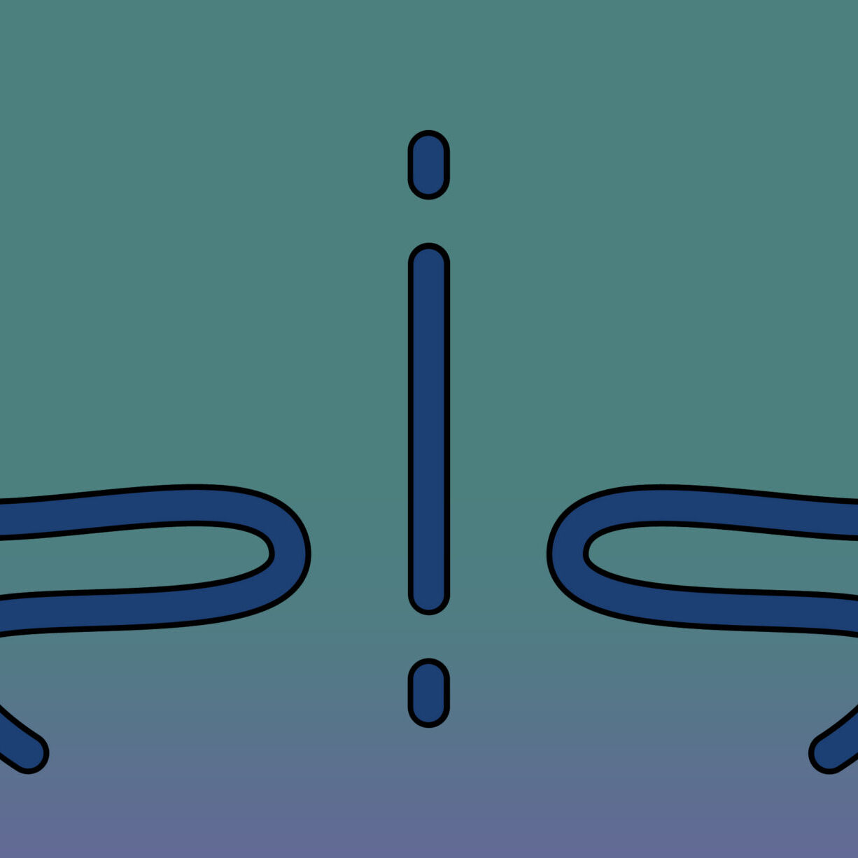
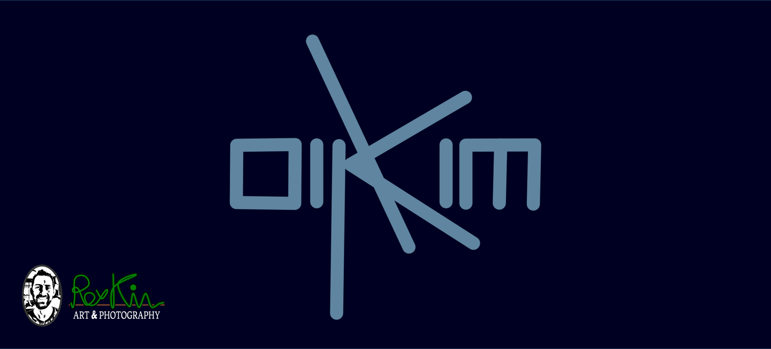
I wanted to create a sort of signature (or icon) for my surname, “Kim,” featuring the name written simultaneously in both Hebrew and English in an intricate, self-complementing design. The intended use is as a header (featured) image for an explanation regarding the Korean origins of the name “Kim.”
While the name “Kim” exists independently in Hebrew—with records dating back at least to the 13-14th century—it also exists in Korean, with a meaning and origin that are distinct yet similar. In Korean, the meaning is “gold”; in Hebrew, however—regardless of whether one finds similarities—the name implies possession, signifying “belongs to me,” and is sometimes interpreted as “clear to me”.
The concept behind the design was to create something elegant using simple, clear lines, echoing the brushstrokes found in Eastern calligraphy (such as Japanese or Chinese styles). Additionally, the design draws inspiration from a font I created back in high school—which, in retrospect, I think I should call it “Bird’s Legs” (or “Chicken’s Legs”), that was built with straight lines and sharp angles; looking back, the letter “Shin” (ש), for instance, resembles a bird’s legs.
Ultimately, I wanted to craft an interesting icon that intertwines my name in Hebrew with its English counterpart, using a style reminiscent of Eastern calligraphy—deceptively simple yet beautiful—embodying the idea of “sophistication lies in simplicity”.